
This project was completed as part of my professional diploma in UX design.
The projects aim was to design an online flight booking process on desktop for the hypothetical Fly UX airline that wished to centre usability as a competitive advantage for the airline.
Fly UX
Project Context :

Collating the research data was an important step in the process, allowing the generation of usable observations.
At this stage the course provided results of a flight booking survey they had conducted that I analysed and took insight from forward into the this amalgamation of data. An affinity diagram and customer journey map were developed as thinking tools to help identify patterns and contextualise my findings.
Putting the Pieces Together
The affinity diagram allowed me to gather diverse information in a coherent manner, and find patterns in the data.
In the affinity diagram a pattern emerged, indicating that although their eventual aim was to book a flight, the users prime aims revolved around researching flights e.g.: comparing flight prices, looking up flight times and dates. Combined with the fact that users visit the site multiple times before booking, indicated that the majority of site visits were made with the aim of researching flights rather than booking them.
Affinity diagram
To contextualise the information contained within the empathy map I created a customer journey map. When setting out the stages of the user journey the aims of the users came in to sharper focus, as they generated a divide between the initial stages of searching for flights and the latter more selection/booking stages of the process. I found it helpful to characterise these as the ‘research mind-set’ and ‘selection mind-set’ to give focus to the user’s goal when designing these elements.
The lowest satisfaction was concentrated in the 'selection mind-set’ stage, specifically the luggage, optional extras and review/confirm flight booking steps. When examining existing sites, it seems realistic to trace some of the blame for high levels of cart abandonment here.
Customer Journey map

Designing the Solution
Flow Diagram
As being open to users at different stages of their research journey was desirable. I designed the flow diagram to focus on creating flexible interactions that were forgiving to different inputs. This necessitated making the searches functionality as broadly accepting as possible, e.g.: being able to search without having made decisions on all travel data to be input. Attention was also given to allowing editing of the search or basket at all stages of the process without having to restart.
As users described using airline sites over an extended period of time adding functionality that allowed a continuity between these visits was designed into the flow diagram, through a save flight/save basket process, functioning similarly to favourites in retail sites.

Identifying the Problem
I first aimed to gain a foundational understanding of the booking process and generate routes for enquire to direct primary research.
This started with a comparative analysis of existing airline and travel sites, as well as reviewing existing research on the subject. Both these actions worked to help establish shared conventions of the flight booking process and form a starting point for speaking to users directly.
Through this initial research some key discoveries that led enquiries were:
-
The airline approached the flight booking process in two different ways that I classed as package and modular. Suggesting users may not have a consistent model of how the flight booking process should go?
-
Multiple sources showed flight booking had one of the highest basket abandonment levels in retail. Why was this the case?
User Interviews and User Testing
Key Findings
User aim=
-
For all interviewed their main goal was to research flight prices and flight dates/times.
-
Having decided to book, the users key aim was to make sure they got the right option (luggage, etc.) for their circumstance and to complete the process correctly and swiftly.
Context of use=
-
Users described using airline sites over an extended period before booking, usually returning to the site multiple times over a few days/weeks.
-
Most users came to the airline sites with some idea of where they wished to go, this often being dictated by an event/family gathering.
-
It was unlikely users had already booked a hotel/holiday before first visiting the site, structuring this as part of their trip research.
User Behaviour=
-
Users had trouble identifying ‘next steps’ and calls to action in a number of instances. This seemed to be because users had a lack of awareness of the steps involved in the booking process, and falsely trying to apply mental models from retail sites, such as amazon, to flight booking.
-
Users consistently got frustrated and confused by the add on and luggage sections. And were particularly annoyed by “unnecessary” upselling, especially towards the end of the booking process.
-
Users got confused by jargon heavy flight options, especially airline specific perks or plans.
I conducted user testing of competing flight booking sites, alongside user interviews with a diverse range of people to observe user behaviour directly and talk through their experience of flight booking.


Page from competitor analysis of Virgin Atlantic home page
Page from competitor analysis of Easy-jet home page
Page from competitor analysis of British Airways home page


I produced several rounds of pen and paper sketches to work through my initial ideas for the site. I worked from the user testing feedback to form a layout that adhered to the mental model of users. Mirroring the conventions set by retail sites where possible, the design committed to a booking process revolving around the basket feature consistently.
Clear indication of the steps of the prosses was also needed, so an effort was made to keep the user fully aware of the context of their actions through a progress indicator, clear mapping of related elements and use of clear copy. Steps were also taken to insure when the user reached the ‘selection mindset’ stage they were not interrupted by up-selling or cross-selling.
Ideation Sketches of UI

Input departure location.
Input destination location
Input departure flight date
Input return/ongoing flight date


Flight result page
Save flight/basket function
Luggage and seating pages
Basket page

Key Findings
Rounds of low and high fidelity prototypes were developed from the selected designs using Figma. At this stage only the key user flow was prototyped; the flight search on the landing page to the basket confirmation page.
These prototypes were user tested at a low fidelity to ensure foundational usability. No issues with the navigation of the prose were fond, however some aspects were highlighted and addressed:
-
Users had trouble identifying what the price shown applied to e.g.: was the flight price per person. So the design was altered to give a clear price breakdown and specify if the price was per person or for all input passengers.
-
Users noted individually adding extra luggage to returning flights was tedious, so an option was added to apply the same luggage allowance to all flights. Automatically applying the luggage to all flights and letting the user opt out, or having a pop up ask if the user wanted to apply the same luggage to all flights was also considered.
-
Copy of ‘seat selection’ was changed to ‘seat reservation’ as users were mischaracterising what this optional extra was for e.g.: was it compulsory to get a seat
Prototyping
Testing the Solution
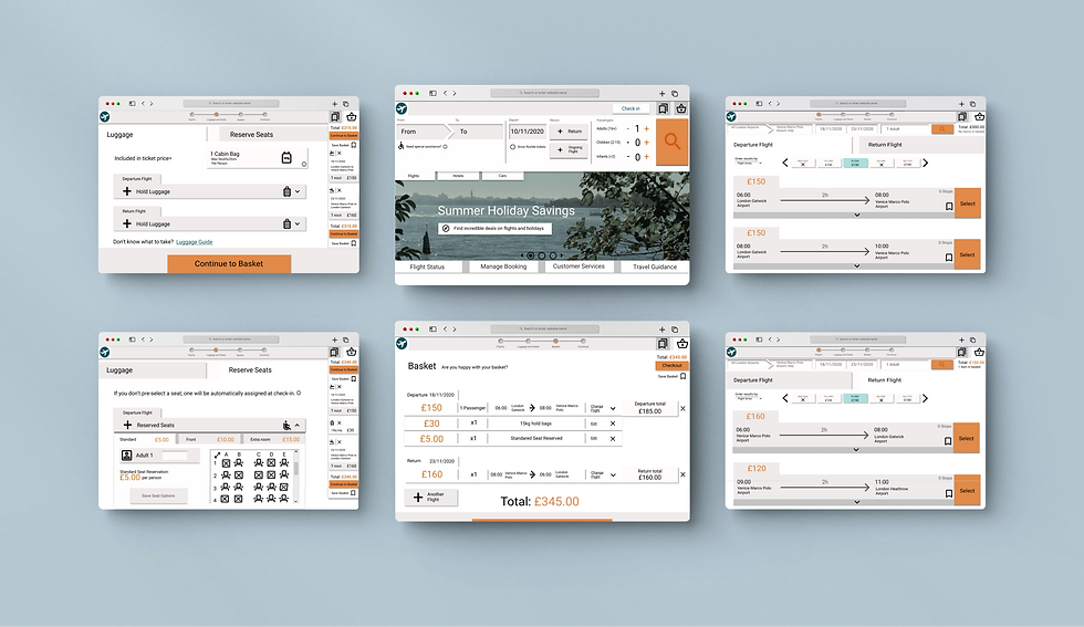


The final step of the project was producing an actionable deliverable in the form of a comprehensive static wireframe. The wireframe produced showed each element of the page and gave detailed notes about its different states through interactions.
Wireframe
Reflection
Although I feel the project was successful in its aim, if this project were to be developed further I would do more specific testing of the save flight function, looking at how it interacted with users mapping of the process and if they felt it should act like a favourites button or bookmarking more.


Design Objectives
The three key problem areas were developed into design objectives.
-
The site should present a clear mental model of how to book flights that matches user expectations.
-
Support the user’s research aim by allowing use of the search flight functionality as a research tool without compromising the user’s ability to book efficiently when ready.
-
Make the ‘booking mindset’ stage of the user journey (from luggage selection to basket review) clear, enjoyable and ensure it maintains user trust.
Challenge
Solution
How can I create a flight search/booking process that matches user expectations while fitting into their travel research process at multiple stages without impeding efficient booking.
An evidence based approach was used to identify user aims and explore there mental models of booking. This research showed that the users primary aim was to research flights. Therefore, I worked towards a design that accounted for this but did not neglect booking capability. This was combined with the utilisation of conventions from other retail and booking sites, identified as contributing to user’s expectation of the process.
1. Users display an inconsistent mental model of the booking process, (package vs modular) and apply false assumptions from retail sites (like amazon).
2. In most cases the users key aim is research based, but the site must not alienate those ready to book flights as this is the key business aim.
3. The latter stage of the user journey, including luggage and seat booking, is seen as confusing and untrustworthy by users